Mastering MACD Calculation and Visualization with Python
Written on
Chapter 1: Introduction to MACD
In the initial section of this article, we explored the Moving Average Convergence Divergence (MACD) technical indicator, its components, and how to interpret its convergence and divergence patterns using Microsoft (MSFT) data. Now, we will shift focus to the coding aspect, where we'll employ Python to compute and visualize the MACD for MSFT.

Chapter 2: Python Tutorial for MACD Calculation
In this segment, we will detail the process of calculating and visualizing the MACD for Microsoft Inc. (MSFT) using Python. We will utilize historical stock data ranging from January 2022 to December 2023, which can be accessed via the yfinance package. The MACD consists of three main elements: the MACD line, Signal line, and MACD Histogram.
Section 2.1: Loading Libraries and Data
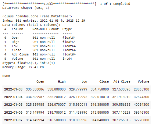
To begin, we will download the historical stock data for MSFT and conduct an initial inspection.
# Import necessary libraries
import pandas as pd
import numpy as np
import matplotlib.pyplot as plt
import yfinance as yf
# Download data from Yahoo Finance
ticker = 'MSFT'
start_date = pd.to_datetime('2022-01-01')
end_date = pd.to_datetime('2024-01-01')
df = yf.download(ticker, start_date, end_date)
df.index = df.index.date
print(f"nDataFrame Shape: {df.shape}n")
display(df.info())
display(df.head())
The output will confirm the successful retrieval of the stock data, displaying the shape and summary of the DataFrame along with the initial rows.

Section 2.2: Visualizing Closing Prices
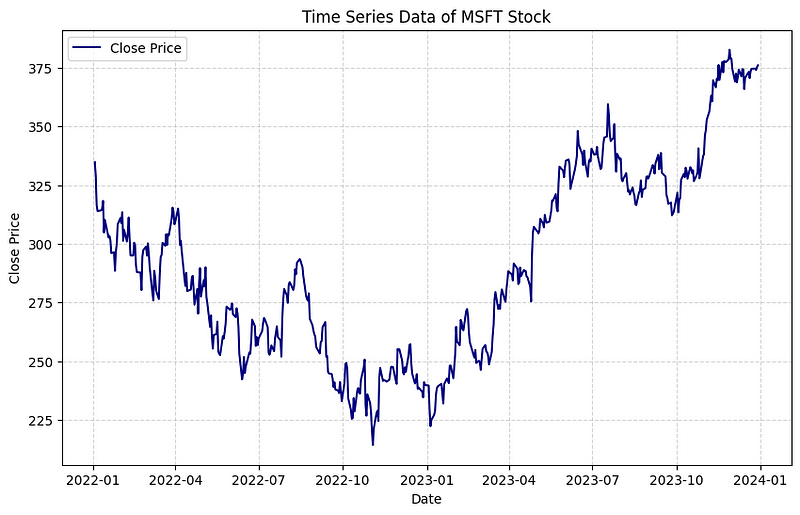
Next, we will visualize the closing price data of MSFT stock using Matplotlib.
# Plot the closing price
plt.figure(figsize=(10,6))
plt.plot(df['Close'], label='Close Price', color='navy')
plt.xlabel('Date')
plt.ylabel('Close Price')
plt.title('MSFT Stock Price Over Time')
plt.legend()
plt.grid(visible=True, alpha=0.5, linestyle='--')
plt.show()

Section 2.3: Calculating MACD
We will now compute the MACD by calculating the Exponential Moving Averages (EMAs) and the MACD line.
# Calculate the 12-day Exponential Moving Average (EMA)
df['EMA12'] = df['Close'].ewm(span=12, adjust=False).mean()
# Calculate the 26-day Exponential Moving Average (EMA)
df['EMA26'] = df['Close'].ewm(span=26, adjust=False).mean()
# Compute the MACD line
df['MACD'] = df['EMA12'] - df['EMA26']
# Determine the Signal line
df['Signal_Line'] = df['MACD'].ewm(span=9, adjust=False).mean()
# Calculate the MACD Histogram
df['MACD_Histogram'] = df['MACD'] - df['Signal_Line']
Section 2.4: Compiling into a Function
We can encapsulate the MACD calculation within a function named calculate_MACD.
def calculate_MACD(df, fast_period=12, slow_period=26, signal_period=9):
"""
Computes the MACD and related indicators for the given DataFrame.
"""
df['EMA_fast'] = df['Close'].ewm(span=fast_period, adjust=False).mean()
df['EMA_slow'] = df['Close'].ewm(span=slow_period, adjust=False).mean()
df['MACD'] = df['EMA_fast'] - df['EMA_slow']
df['Signal_Line'] = df['MACD'].ewm(span=signal_period, adjust=False).mean()
df['MACD_Histogram'] = df['MACD'] - df['Signal_Line']
return df
Section 2.5: Visualizing with Matplotlib
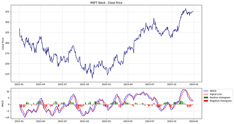
Now, we will create a plot that includes both the closing price and the MACD.
# Create subplots
fig, (ax1, ax2) = plt.subplots(2, 1, figsize=(15, 8), gridspec_kw={'height_ratios': [2.5, 1]})
# Plot close price
ax1.plot(df.index, df['Close'], label='Close Price', color='navy')
ax1.set_ylabel('Close Price')
ax1.set_title('MSFT Stock - Close Price')
ax1.grid(visible=True, alpha=0.5, linestyle='--')
# Plot MACD
ax2.plot(df.index, df['MACD'], label='MACD Line', color='blue')
ax2.plot(df.index, df['Signal_Line'], label='Signal Line', color='red')
pos_hist = df['MACD_Histogram'] > 0
neg_hist = df['MACD_Histogram'] <= 0
ax2.bar(df.index[pos_hist], df['MACD_Histogram'][pos_hist], label='Positive Histogram', color='green', alpha=1)
ax2.bar(df.index[neg_hist], df['MACD_Histogram'][neg_hist], label='Negative Histogram', color='red', alpha=1)
ax2.set_ylabel('MACD')
ax2.grid(visible=True, alpha=0.5, linestyle='--')
ax2.legend(loc='upper left', bbox_to_anchor=(1, 1))
# Show plot
plt.tight_layout()
plt.show()

Section 2.6: Visualizing the Chart with Plotly
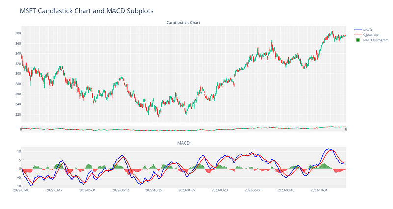
Next, we will create an interactive visualization using Plotly.
# Import necessary modules from Plotly
from plotly.subplots import make_subplots
import plotly.graph_objects as go
# Create Figure with two subplots
fig = make_subplots(rows=2, cols=1, shared_xaxes=True, row_heights=[0.7, 0.3],
vertical_spacing=0.15, subplot_titles=("Candlestick Chart", "MACD"))
# Subplot 1: Plot candlestick chart
fig.add_trace(go.Candlestick(
x=df.index,
open=df['Open'],
high=df['High'],
low=df['Low'],
close=df['Close'],
increasing_line_color='#00cc96',
decreasing_line_color='#ff3e3e',
showlegend=False
), row=1, col=1)
# Subplot 2: Plot MACD Line
fig.add_trace(
go.Scatter(
x=df.index,
y=df['MACD'],
mode='lines',
name='MACD',
line=dict(color='blue')
),
row=2, col=1
)
# Plot Signal line
fig.add_trace(
go.Scatter(
x=df.index,
y=df['Signal_Line'],
mode='lines',
name='Signal Line',
line=dict(color='red')
),
row=2, col=1
)
# Plot MACD Histogram
histogram_colors = ['green' if val >= 0 else 'red' for val in df['MACD_Histogram']]
fig.add_trace(
go.Bar(
x=df.index,
y=df['MACD_Histogram'],
name='MACD Histogram',
marker_color=histogram_colors
),
row=2, col=1
)
# Update layout for better readability
layout = go.Layout(
title='MSFT Candlestick Chart and MACD Subplots',
title_font=dict(size=25),
plot_bgcolor='#f2f2f2',
height=800,
width=1500,
xaxis_rangeslider=dict(visible=True, thickness=0.03),
)
fig.update_layout(layout)
fig.show()

Conclusion
In conclusion, this guide has provided a comprehensive introduction to calculating and visualizing the MACD indicator in Python. I hope you found it informative and are encouraged to explore other technical indicators in Python. Thank you for reading!
Video: Algorithmic Trading in Python - MACD: Construction and Backtest - This video demonstrates the construction and backtesting of a MACD trading strategy using Python.
Video: Python For Finance - Backtesting MACD trading strategy - This video covers how to backtest a MACD trading strategy using Python.